

When creating my media product I have tried to use, develop
and challenge the forms and conventions of real media products. I have decided
to show how I think I have done this well by comparing real media product
screenshots with my film trailer. The research i conducted before starting the
production of my trailer helped me understand my chosen genre, which was
horror. When doing my research i found different conventions used, that are
used when making a film in the style of my genre. This helped me as i was able
to use the conventions to create my trailer. Some conventions included the
institution logo and different codes, conventions and theorists, like barthes
enigma code which is a theory that suggests a text (whether that be television,
film, or poster etc.) portrays a mystery to draw an audience in, pose questions
and makes an audience become intrigued in the piece. Claude Lévi-Strauss'
theory, which was binary oppositions which meant; a situation is reducible to
two possible answers or states. It is a pair of theoretical opposites, for
example, alive or dead, day or night, good or bad. This is used to keep the
text interesting, for example the trailer would have good and bad to keep the
storyline interesting. All these have been used in my trailer to keep it
interesting to the audience and make it look professional.

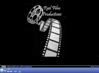 For this example I wanted to show how I used and challenged the forms and conventions of real media products. My institution logo was created by looking at various other institution logos in which I researched. The reason why it is necessary to including an institution logo in my trailer was because all the trailers I had researched included them. To challenge typical conventions I decided to change where the text on the logo was positioned, usually above or below the image used in the institution logo, whereas I had decided to place the text in the top right hand corner of the image, breaking conventions. I stuck with the convention where the institution logo would begin at the start of a trailer, so that the institution logo would become recognisable and so people would link the logo to the trailer easier.

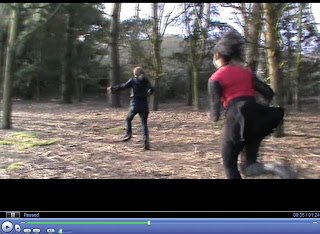 I think that I have used and challenged conventions of the horror genre using the the mis en scene, locations and camerawork such as the soundtrack, camera angles and edits. Both of these shots are similar in the way that both use a mid to long shot to capture 2 people running. The locations of the shots are both similar and so this works to my advantage, trying to portray a specific scene. In this scene I used a the mid to long shot was used of a women running away from another character, the killer, because I wanted to allow the audience to take in the surroundings, in which the most of my trailer would be filmed. As the trailer is filmed in the woods, I think that used the location convention to show the genre of horror. this is because a lot of horror films are filmed in the woods.

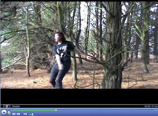 I focused upon my lighting throughout my trailer, having the cover of the trees as shade. although the trees created shadow, it was not enough to make the trailer look darker. Within this scene, I tried to use a limited amount of light to create a more sinister and dark look to the trailer reenforcing the genre, being horror. This is a typical convention within horror trailers that I tried to follow because it instantly represent to the audience that it is a horror trailer.


Usng a two shot helps the audience get to know some of the characters. this scene is very important in knowing what the rest of the trailer is, this being the equilibrium. having the two characters in the shot means that the audience can understand the link between the two characters and understand why, in the case of my trailer, one of the teenage girls went to the woods on her own. The shots are also used to show the emotional reactions between the characters and is used in most films, sometimes without even intending this type of shot to happen

I added text to my media product in order to give the audience more infomation about my media product. Above is an example of the text shown in 'The Hunger Games' trailer. Both trailers include infomation that does not give infomation about the events happening in the trailer but many trailes add infomation about other films produced by the production company. I have used this screenshot to highlight the use of developing of a real media products. the font is specific to the trailer as 'The Hunger Games' includes a golden compas which makes the text link to this. Although there is nothing to link the text to my trailer, i think that the font i used works well and highlights the name of the trailer more specifically.
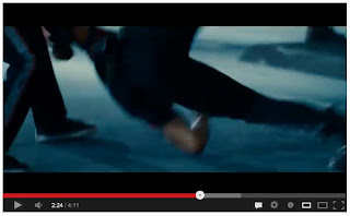

Again this is another two shot which shows the emotional reactions between the characters in the fight scene. Most horror film trailers will have an aspect of a fight scene to make the trailer more intreresting, showing that the antagonist might not win the battle between good and evil.
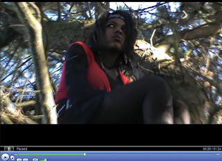 Having this low angle shot means that the audience can see upwards. This can make something seem more aggressive as they look larger and more intimidating. Having a low angle shot also means that the audience can view something that may not have been spotted by a character. In my trailer, this is the antagonist, in the professional trailer, it is the pece that is not visible from ground view.
I started the soundtrack that i used after
the sound for the institution logo played. I listened to other institution
logos to hear what sounds were used to combine with the institution logo and
found that Metro Goldwyn Mayer used a loins roar as the sound to accompany the
logo. i thought about adding a sound to my logo in the same way and decided to
make the sound for the logo of an old fashioned film reel. The music to accompany
my trailer was slow at the start and so i did not need to fade this at all.
Most trailers make their music at the start of a trailer slow so that the sting
in the music can kick in at the disequilibrium of the scene and connote an aspect
of horror. Because the soundtrack gradually increased throughout the trailer
this meant that i had used another convention that i had researched in other
trailers.


