| Directed by | Omar Naim |
|---|---|
| Produced by | Lucas Jarach Nesim Hason |
| Starring | Nick Stahl Rose McGowan Amy Smart |
| Music by | John Hunter |
| Cinematography | David A. Armstrong |
| Editing by | Miklos Wright |
| Studio | First Look Studios |
| Release date(s) |
December 3, 2010
|
| Country | United States |
| Budget | $3.5 million |
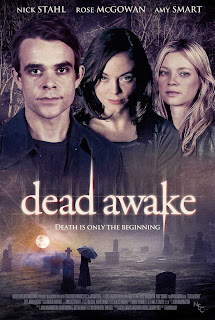
The poster shows the audience details of the film for example; the actors who play the protagonists in the film. The reason for this to show the audience that there is more of a chance that the film will be enjoyable as it tells the audience that they may have already seen the actors in other films, liked their work and so will go to see the film. The design of the poster ‘Dead Awake’ includes a screen shot of one of the scenes in the film and shows the characters from the film, this is put together to form the poster. the two images are joined by the title of the film going straight across the middle of the poster. This makes it easier to join the two images together.
You can tell this poster is for a horror film as the colours used are dark. This makes the text on the poster stand out as it is a yellow colour with blends with the colour of the sun. The text on the poster uses lower case letters to emphasise the peace created in the titles colour and font which contradict with what the text says. The poster uses opposites to make the audience think about the contradictions employed in the poster and the film. The differences in the poster also help us understand the differences that may occur in the film. The poster gives off a very dark feeling as the images used are taken in dark places, for example; the woods and a cemetery. These places could connote an evil, and sinister theme to the film. the woods are usually used in horror films as it’s a way to implement fear towards the audience as they know that the woods are a lonely place and if anything were to happen to a character in the woods the audience would know it is likely that no one will hear them scream. The use of dark colours makes the evil, sinister theme that has been used in the poster. Using the small amount of colour on the text and the moon on is important as it makes the poster eye-catching as the colours clash. The use of the colours on the poster would show a prospective audience what the film may be about.
The poster uses a catchy slogan “Death is only the beginning” to help promote the film for its release. The slogan may help the audience understand what the film could be about, this would then let the audience know whether or not they wish to see the film. for anyone who did not understand what the slogan meant after seeing the poster may also want to see the film to get a better understanding of what the slogan could mean.
No comments:
Post a Comment