Friday, 24 August 2012

Magazine Research 2


The masthead is large and takes up about a quarter of the page. The word 'TOTAL' has been cut out of the top of the F in the word 'FILM' which means saves space and means that the word film can be bigger than it would have been able to be if the word 'TOTAL' was above it. The white font contrasts strongly with the background making it eye-catching to the intended target audience. The main image is overlapping the masthead but because the name of the film magazine is well known it does not really matter too much. The main image of Robert Downey jr/Sherlock Holmes is overlapped over the top of the masthead, but still stands out well. The text is large and white stands out on the light blue to dark blue background The title of the magazine is positioned near the top of the cover also signifies it’s importance of the name of the magazine. Because the magazine is so iconic, it can easily get away with having an image overlapped over the top of it because readers will still know what the name of the magazine is. Even if you have never read the magazine before the name is still recognizable. This sticks with the conventions of magazines as the main image usually overlaps the masthead. i would like to see how having the masthead over the main image would look too, just to see if this would work when creating my magazine.
 
The film magazine V below has the protagonist behind the masthead
The main image of the magazine cover is of the protagonist. This lets the reader know exactly what the main article in the magazine is on. The main image is very effective as the protagonist is looking directly at the camera, like in the last magazine, making it appear as if 'Sherlock' is looking directly at the reader. The expression on the face of the protagonist is captivating, especially the mood in the eyes and so makes the audience want to look at the face. the main image is always the focal point of the magazine and so should be of a high quality in order to have an intended effect on the audience.
 
The magazine contains coverlines to help  the audience understand what else is in the magazine and is there to help an audience decide whether or not to buy the magazine. we can see that the magazine is based around mistery as this appeals to a large audience. This is because the main image is
Mystery, thriller, action/adventure. The genre of the film inglourious basterds (Basterds! Tarantino on his boldest movie yet’ & ‘Sneaky! The secret history of movie virals’) is thriller, action/adventure and drama. this means that the sell lines link in with the main article and main image. Text is  also layed across the main image Sherlock Holmes’, ‘On set! Cracking the case of the world’s greatest detective’ to let the audience know that the main image is of 'Sherlock Holmes’.

This magazine contains a barcode, date, issue number and website in a small text size. Well, in a similar manner to the website, the date and price is also very small compared to every other aspect of the magazine cover, and is positioned in the left hand corner, below the masthead/name of magazine, but still remains essential.The reason that it is small is so that the text doesn't distract the audience  from the main image, this is a common convention of magazines.  
 
Extra! The Matrix decoded, The fantastic Ms Fox, Apatow on Apatow’
Exclamation marks build up the sell lines making it appear exciting to the reader. this sell line is positioned oppisite to the other sell lines, which helps links everything together. The sell lines use short and snappy sentences making them more intersesting and not tiresome to read.  the language techniques are cleverly used to get the audience interested  in other aspects of the magazine. the sell lines summarise what an audience can expect to read inside without giving them too much infomation or giving too much away.

Wednesday, 22 August 2012

Magazine Research 1


EMPIRE magazine Iron Man 2

The masthead for this magazine is placed at the top of the page and coving about one quarter of the page. The text is large and is in blocked capitals. The reason for doing this is this makes it stand out therefore more eye-catching for the reader. The colour of the text is white with a blue glow surrounding it. This means that it can contrast easily with the main image. The masthead is partially covered by the main image, but this does not affect the magazine as it is such a popular magazine that most people would know it spelt out 'EMPIRE'. Having the masthead covered slightly is a common convention of magazine covers, be it music, film or fashion, as it makes the feature of the magazine stand out. By having the man in an armoured suit in front of the text, it gives the audience the feel that he is coming right at us.

The main image is very effective as the 'man in the iron suit' is looking at the audience making it appear as if he is looking directly at them and so catching their attention. The protagonist eyes are glowing which also makes the reader want to look into them. Because of the expression on the face of the protagonist, the audience look at it and start to wonder. The main image is of the protagonist, the background is a blue colour, meaning that the attention is not taken away from the main image. If, for example, the main image was placed on top of a brightly coloured background or a background that was a place, the attention would go from the main image to the background.

The main image is of the protagonist in the film 'Iron Man'. The main image is there to catch the attention of an intended target audience. For readers that may not know anything about the film but find the protagonist very interesting, it is useful to have the name of the film going across the main image. This is so that anyone who did not know what the name of the film was now knows and may decide that they want to go to see the film

This particular magazine also contains a barcode, date, price but not a website. Having a website on the front of the magazine means that the reader can look at other forms of media, for example the trailer. The website would only have to be in a small font so that it would not deter attention away from the main image but would help an audience gain even more information if they wished. I think this magazine looks professional but think that if the magazine cover had some sell lines in a similar convention to most magazines then this would be even better.

Overview.

Tuesday, 21 August 2012

Website Analysis: The Ring

http://thering.asmik-ace.co.jp/


"The Ring" website uses the stereotypical dark colours to represent what genre the film is and links the film and website together. Using the red text across the bottom of the page, even thought the font size is small, grabs the viewers attention, leading them to see '5.2 video & DVD on sale' this shows the audience that they can buy things from the site . The colour red connotes blood and this is important when showing the genre of the film. Although the page only uses a small amount of red text on it, the web page uses hints of red flashing behing the images on the screen. this attracts an audience to different parts of the web page. For example the word ' download' flashs red to grab the audiences attention and making them click on the worg to find out what they can download.

By using the circles on the top left of the image we can tell the pencil marks are important . The marks add familuaraty to the web page as it graphically matches the circles on the trailer, through the mirror and the well in the film.


When hovering over one of the images we can see it turn the blood red colour. It also shows a word appear, when hovvering over the tree, the word 'child' appears. when hovering over the circles the word 'mother' appears. This shows an audience they can choose what page they want to visit. This means the audience have a veriaty of things to look at.

 The dark colours suggest sinister goings on. Although diverting to the next page of the website, the same layout is used to accustom the audience so they can identify the layout and website easily. The audience can then establish what they want to on the page and then find out all the infomation they need/ what to know.
the black background is constantly used throughout the website to make each page link together. the white text on the background also shows consistantcy throughout the


Tuesday, 14 August 2012

Website Analysis: SAW

http://www.officialsawfanclub.com/


The saw website uses the stereotypical dark colours to represent what genre the film is and thus links the film to the website. Using the red strip across the top of the page grabs the viewers attention, leading them to see 'THE "SAW" AUCTION'. This shows the viewers that they can buy Saw memorabilia, props and even autographs by the cast.

Bobby the ventriloquist puppet is shown on the left hand side of the website. This adds familiarity to the web page as everyone who has seen the Saw films will know of him and so will know they have got to the right page. The colours used on the website are dark and dismal. This shows us the theme of the theme of the website and how it relates to the film. As i want to make my trailer for a horror film, i will use dark colours on my website to show how the colour interlink with the genre of my trailer. As red is an important colour which conotates blood i may also use the colour red on my website.


When looking closer at the website we see that a membership is necessary in order to enter the site properly. Becoming a member means you have to pay for the right to use the website. there are three options to choose from. they include the option to have:

10% Off All Official SAWFANATIC.COM
Items for the duration of your subscription.

  • Betsy Russell Autographed Color Glossy 8X10 Inch Photo. Betsy Russell plays "Jill" - Jigsaw's Wife in the SAW movies.
    blank
  • Limited Edition Special Color 8x10 Inch Glossy Montage Photo Featuring 9 Great Stars of the Star Franchise including: Jigsaw, Amanda, Adam & (6) Other Stars
    blank
  • Access to Official SAW Store Only Exclusives
    blank
  • Access to Official SAW Auction Special Props, Wardrobe and Autographs


  • 15% Off All Official SAWFANATIC.COM
    Items for the duration of your subscription.
  • Costas Mandylor Autographed Color Glossy 8X10 Inch Photo. Costas Mandylor plays "Hoffman" in the SAW movies.
    blank
  • Costas Mandylor ("Hoffman") Autographed Limited Edition Special Color 8x10 Inch Glossy Montage Photo Featuring 9 Great Stars of the Star Franchise including: Jigsaw, Amanda, Adam & (6) Other Stars
    blank
  • Access to Official SAW Store Only Exclusives
    blank
  • Access to Official SAW Auction Special Props, Wardrobe and Autographs
    blank
  • Access to Official SAW Store Only Exclusives
    blank
  • Access to Official SAW Auction Special Props, Wardrobe and Autographs

  • ,20%  Off All Official SAWFANATIC.COM
    Items for the duration of your subscription.
  • SAW IV Official Script Autographed By (12) Stars: Costas Mandylor ("Hoffman"), Betsy Russell ("Jill" - Jigsaw's Wife), Billy Otis ("Cecil"), Mike Butters ("Paul" - SAW and SAW 4), James Van Patten ("Dr Hefner"), "Justin Louis ("Art"), Sarain Boylan ("Brenda"), Simon Reynolds ("Lamanna"), Producer Mark Burg, Producer Oren Koules (Who Also Played the Mystery Man with the Question Mark on His Chest in Saw, Saw 3 and Saw 4) and Saw 4 Writers Patrick Melton and Marcus Dunstan.
    blank
  • Costas Mandylor ("Hoffman") Autographed Limited Edition Special Color 8x10 Inch Glossy Montage Photo Featuring 9 Great Stars of the Star Franchise including: Jigsaw, Amanda, Adam & (6) Other Stars
    blank
  • Gorgeous SAW "Puppet" Black and Red Backpack - Officially Licensed
    blank
  • Special VIP Access to Official SAW Store Only Exclusives
    blank
  • Special VIP Access to Official SAW Auction Special Props, Wardrobe and Autographs

  • As we can see it say things like 10% off we understand that this is a paid site, which could put some viewers off. When creating my website i would not charge for use of the website and information on it  although the two web pages wold be completely different in what they provide it is more likely for a website to have more costumers if it is free. if i decided to use a domain for my website, which would cost me, the best way to earn money to pay for the domain would be to advertise. this means the viewer would not need to pay for the use of the site, the advertiser would be able to advertise  and the owner, me would be able to retrieve money of the advertiser for time spent making the site, the cost of the website domain, a bigger server if necessary depending on how many people use the site, ECT.

    There are also forums where viewers can talk to others about different topics about "SAW" but again this means logging in or regestering to the site. This may put some people off the website and may mean that they will not want to  sign up  as this means that they made a comitment to the website. 
    There is also a spcial SawMania page which take the viewer to a page to see details of the SAW cruise. This tells the viewers which actors will be on the cruise and how much each room on the cruise costs. For my website i will have a page for members but this would be optional which means that you would not need to become a member to enjoy all that my site would have to offer.


    Sunday, 12 August 2012

    Poster Analysis: Dead Awake


    Directed byOmar Naim
    Produced byLucas Jarach
    Nesim Hason
    StarringNick Stahl
    Rose McGowan
    Amy Smart
    Music byJohn Hunter
    CinematographyDavid A. Armstrong
    Editing byMiklos Wright
    StudioFirst Look Studios
    Release date(s)
    December 3, 2010 (2010-12-03)
    CountryUnited States
    Budget$3.5 million


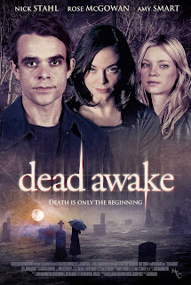
    The poster shows the audience details of the film for example; the actors who play the protagonists in the film. The reason for this to show the audience that there is more of a chance that the film will be enjoyable as it tells the audience that they may have already seen the actors in other films, liked their work and so will go to see the film. The design of the poster ‘Dead Awake’ includes a screen shot of one of the scenes in the film and shows the characters from the film, this is put together to form the poster. the two images are joined by the title of the film going straight across the middle of the poster. This makes it easier to join the two images together.
    You can tell this poster is for a horror film as the colours used are dark. This makes the text on the poster stand out as it is a yellow colour with blends with the colour of the sun. The text on the poster uses lower case letters to emphasise the peace created in the titles colour and font which contradict with what the text says. The poster uses opposites to make the audience think about the contradictions employed in the poster and the film. The differences in the poster also help us understand the differences that may occur in the film. The poster gives off a very dark feeling as the images used are taken in dark places, for example; the woods and a cemetery. These places could connote an evil, and sinister theme to the film. the woods are usually used in horror films as it’s a way to implement fear towards the audience as they know that the woods are a lonely place and if anything were to happen to a character in the woods the audience would know it is likely that no one will hear them scream. The use of dark colours makes the evil, sinister theme that has been used in the poster. Using the small amount of colour on the text and the moon on is important as it makes the poster eye-catching as the colours clash. The use of the colours on the poster would show a prospective audience what the film may be about.
    The poster uses a catchy slogan “Death is only the beginning” to help promote the film for its release. The slogan may help the audience understand what the film could be about, this would then let the audience know whether or not they wish to see the film. for anyone who did not understand what the slogan meant after seeing the poster may also want to see the film to get a better understanding of what the slogan could mean.

    Poster AnalysIs: Shutter


    The poster emphasises details of the film for example; other films produced by the same producer ‘The Grudge’ and ‘The Ring’”. The reason for this to show the audience that there is more of a chance that the film will be enjoyable as it tells the audience that the producers have filmed other successful films and so this film is more likely to be successful as well. The design of the poster ‘Shutter’ includes a collection of screen grabs from the film, all put together to form a horrific face. This tells us that the poster is for a horror film and so people interested in horror films may be more interested in watching it.
    You can also tell this poster is for a horror film as the colours used are dark. This makes the text on the poster stand out as it is white. The ‘Shutter’ poster gives off a very dark and unnatural feeling. This connotes darkness which most horror films use in their posters and trailers as it’s a way to implement fear. The use of dark colours contributes to the unnatural theme that has been used in the poster and the colour red could connote blood which could also mean suffering and pain. Using red on this poster is important as it makes the poster even more eye-catching to an intended audience. The use of the colour black would connote evil and death and would show a prospective audience what the film may be about.
    The poster uses a catchy slogan “The most terrifying images are the ones that are real” to help promote the film for its release. The slogan portrays how horrifying the film may be, scaring the audience and making them want to see the film. The audience may not understand what the slogan means and so may also want to see the film to get a better understanding of it.
    The text on the poster contrasts with the background, as it uses white text on a black background, to help make it clearer to the audience. Using caps locks on the text helps make the text more identifiable to the audience and makes it stand out more. The size of the font for the title is larger than the rest of the text and so makes the title of the film eye catching and means that an audience are forced to see the face on the poster which is made out of smaller poster and are forced to see the title. If the audience is intrigued by the images that create the face they may wish to go and see the film.


    Directed by

    Masayuki Ochiai
    Produced byTakashige Ichise
    Roy Lee
    Doug Davison
    Written byLuke Dawson
    StarringJoshua Jackson
    Rachael Taylor
    Music byNathan Barr
    CinematographyKatsumi Yanagijima
    Editing byTim Alverson
    Michael Knue
    StudioRegency Enterprises
    New Regency
    Vertigo Entertainment
    Distributed by20th Century Fox
    Release date(s)March 21, 2008 (USA)
    May 15, 2008 (Australia)
    Running timeTheatrical cut:
    85 minutes
    Unrated cut:
    90 minutes
    CountryUnited States
    LanguageEnglish
    Japanese
    Budget$8 million
    Box office$47,879,410

    Poster Analysis: The Haunting of Molly Hartley


    Release Date: October 31, 2008
    Studio: Freestyle Releasing
    Director: Mickey Liddell
    Screenwriter: John Travis, Rebecca Sonnenshine
    Starring: Chace Crawford, Haley Bennett, Shannon Marie Woodward, Shanna Collins, AnnaLynne McCord
    Genre: Horror, Thriller
    MPAA Rating: PG-13 (for strong thematic material, violence and terror, brief strong language and some teen drinking)
    Official Website:
    TheHauntingofMollyHartley.com
    The main image of characters on the front of this poster depicts a horror movie. This is because of the colours used on the clothing, the characters are wearing. The black background works well in causing the characters to stand out on the white cross that has been formed around the cast.
    The actors’ names are shown at the top of the poster, matching the conventions of film posters. This film poster shows us the characters order of importance and appearance in the film, reading from left to right.
    The title has been designed to reflect the film’s genre; using capital letters, usually related to shouting, to show the genre of Horror well. The large font positioned in the centre of the poster has been used to attract the audience’s attention. The poster also uses a famous actor in big to ‘hook’ the actor’s fans into watching the film.
    The slogan is used to taunt the audience into what to expect to expect when they watch the film. The tag line here suggests some mystery may be involved which will persuade the audience to find out the significance behind it by watching the film.

    The text on the poster contrasts with the background helping in making it clearer to the audience. Using caps locks on the text helps make the text more identifiable to the audience and makes it stand out more.  

    Thursday, 9 August 2012

    Trailer Analysis: Shutter

    Directed byMasayuki Ochiai
    Produced byTakashige Ichise
    Roy Lee
    Doug Davison
    Written byLuke Dawson
    StarringJoshua Jackson
    Rachael Taylor
    Music byNathan Barr
    CinematographyKatsumi Yanagijima
    Editing byTim Alverson
    Michael Knue
    StudioRegency Enterprises
    New Regency
    Vertigo Entertainment
    Distributed by20th Century Fox
    Release date(s)March 21, 2008 (USA)
    May 15, 2008 (Australia)
    Running timeTheatrical cut:
    85 minutes
    Unrated cut:
    90 minutes
    CountryUnited States
    LanguageEnglish
    Japanese
    Budget$8 million
    Box office$47,879,410


    20th century fox is a popular institution, that may psychologically help the audience decide whether or not they wish to watch the film. Films made by 20th century fox are usually popular with people and make  large amount of money at box office and through DVD release.


    Another institution that that are somewhat popular is regency. If the audience like watching films by this institution, they may recognise the film to be by regency and go to watch the film.


    By saying "From executive producers of the grudge and the ring" the audience can see what films have been made before by the executive producers and whether the films created were successful. This may then make the audience think about whether they want to see the film. The text is small which may not catch the audiences attention in comparison to using larger text but the audience still may want to watch the film as it is from the creator of" The Grugde".

    The start of the trailer shows a camera, the ambient sound matching the image, which already tells the film has to be about a camera of some sort. At this stage of the trailer the genre of the film us unknown but with the dark colours used in this shot leads us to believe that the film could be a horror or thriller film.

     we then see defected images on screen that show what seems to be some sort of energy shown on screen. the voice over then says "the pictures you are about to see are real." this adds an affect to the trailer as the audience then know that the film was loosely bases on a true story. This means the audience are more likely to watch the film as they believe this could then happen to them.
    The trailer then shows the audience some of the real life images that are shown throughout he film. incidental music is played in the background which is sharp and adds to the mood of the trailer.

    Incidental music starts, as the audience see a skeleton. This builds tension and can scare the audience which can help make them more likely to go and watch the film. Still using a voice over around each shot, to work around the incidental music, means that the audience can gain more information on the film and determine whether they wish to go to see the film.

    The feminine voice over adds a little mystery to the trailer. It also adds peace to the horror film that would usually add uncertainty, tension and fear. The voice seems to be calm and so this means we do not hear fear in the voice, this makes us as the audience worry less. this is an example of Claude Levi Strauss' theory of binary opposites. His theory suggests that for a text to be interesting towards an audience the text needs to have many opposites for example good and evil.

    It is important to tell the audience when they can expect to be able to watch the film. The trailer should give as much information to the audience as possible but as this is a teaser trailer it only needs to give an indication to when the film will be out. This means that the audience are more likely to watch the full trailer to find out when the exact date of the replace of the film. Before this shot there is worrying incidental music playing in the background but as this shot appears there is a sting. This could suggest the importance of the shot. By making the text black, contrasts with the cream background, the text becomes clearer even if it is small.

    The pace of this shot is extremely fast. This could suggest the shock of the character. The background of this shot is very dark which adds to the mood of the trailer and gives the character a look of worry.


    Using a close up shot of these two characters, we are able to see the emotion both characters are portraying. This means that the film may be more popular as it shows romance and horror, this then opens up the target audience.


    The name of the film is finally shown at the end of the trailer. This means that if people want to watch the film they have to wait until the end of the trailer before they find out what the name of the film is. This also means that the audience will get as much intimation about the film as possible before they get to see the name. the name of the film comes up at the end of this trailer as it makes sure that the audience has to watch the whole trailer before they find out the film that they wish to watch.

    The location of this film was set in a house this means that the trailer would show the setting of the film and help the audience understand the trailer more. The information would help the audience get a glimpse into the storyline of the trailer, a horror film that is set in a house usually suggests that the house is possessed.