Saturday, 16 March 2013

Evaluation Question 4


How did you use new media technologies in construction and research, planning and evaluation stages?

What I used:


I researched the different film magazines covers, film posters and trailers to see how they could inspire me when creating my film magazine, poster and trailer. I used the search engine GOOGLE to find all the information I needed. I then evaluated each magazine cover, poster and trailer and published it to the blog I had created, using Blogspot.com.  

I then used the camera to take the images for my poster and magazine cover. I took some of the image indoors and some of them outdoors. When taking the photographs of my models indoors I wanted to use the flash so that the skin on my model would look paler and so that many imperfections would disappear.

I then went on the computer to edit the image and get rid of the rest of the impurities on the model. This was created using Photoshop. The technology was different from any other program I had ever used but I had found it better to use.

The next thing I did was use Microsoft Word to create a draft of what my magazine and poster should look like.

I then uploaded the draft magazine cover to Blogspot.com as this was one way that I could show my progress.

I used Photoshop to add the text on the magazine cover and poster and then when the poster and magazine cover was finished I uploaded it to my blog.


Thursday, 14 March 2013

Evaluation Question 3


What have you learned from your audience feedback?

To gain some feedback about my media product I asked a targeted audience about my trailer and what they thought about my media product. I also posted the trailer online, on YouTube to get audience feedback from people who wanted to give feedback on my product. The questions I wanted to know were:

In what ways does my trailer remind you of other trailers? And what do you think the strengths and weaknesses of my trailer are?


First question

In what ways does my trailer remind you of other trailers?


This is the feedback I got online, after posting my work on YouTube. If I had posted the trailer on YouTube for longer I may have had more comments.

Comments I received after showing my trailer to a group of friends.
"I like the music in the background; it goes well with the genre of the film."

"The plot of the trailer is good, all trailers should have a good plot"

"The trailer has fast parts to it which makes it more interesting, I have seen lots of trailers that have fast trailers, mainly action and horror.

Comments I received after showing my trailer to a media student. "I like the font used to give more information, as lots of trailers use strong fonts to help the trailer become eye-catching"


I received a lot of feedback from this question which was good. The comments were very positive. People thought that the different features my media product includes are very similar to real life trailers of the same genre. Many people were impressed with the background music and how I had used it effectively in order to add pace to parts of my trailer.


Responses to second question:


"I think the music on the trailer works effectively as it makes it feel like something disturbing is about to happen"

"I like the different types of shots and angles used to create your trailer, for example the tilt used in the fight scene."

"I think the music is one of the strong points because it works well with the rest of the trailer."

"I like how the heart beat sound hits when something is about to happen, like when the girl wakes up and turns her head in worry."

The main strength in my trailer is the sound and music I have used. This is something I feel very pleased about as I think it can be difficult to find the perfect piece of music to fit a specific trailer. Although most horror trailers use slow music with a sting when a piece of action is about to take place, the same piece of music may not suit two different types of horror trailer.

Responses to third question:


"I don’t think the quality of the trailer is good as professional trailers, but think this could be to do with the type of camera used."

"I think the brightness of the filming doesn’t really tell me that the genre of the film is horror. If the set was a little darker then it would seem more like a horror film trailer."

I agree with all these points and if I were to create my trailer again then I would listen to the advice given although some thing could not have been helped, for example, the quality of the trailer, as this was to do with the camera not being as good quality as something that professionals would use.

Tuesday, 12 March 2013

Evaluation Question 2


How effective is the combination of your main product and ancillary texts?


 I think my main product works well with my ancillary texts. The reason for this is that I have kept to the same colour scheme throughout all my products; I have also kept to the same font and colour of text for my film title throughout. For my main product which was the trailer I used a silver text with specific font to give the viewer additional information about the film for example the title of the film and release date. I wanted to use the same font throughout each construction to help each product link together. When creating the ancillary texts I couldn't find the same font necessary to keep the continuity between all my products and so had to print screen the font so that I could use that font and title of the product and obtain the exact colour scheme throughout. The colour grey is a shade of the black that is usually related to horror and so enhances the genre I wished to portray as the common connotations of this colour are darkness and negativity. Black also connotes mystery, evil, death misery and fear. Using the shade of grey means that the connotations are similar but not as strong. Grey is the combination of black and white and is the most neutral of all the shades which means that the Levi Strauss- Binary opposition theory, showing good and evil, life and death E.C.T.

I have also tried to keep the protagonist/ antagonist an on-going theme in my ancillary texts, for example I have made sure that the antagonist used in my main product, is in both my Poster and Magazine cover. To create an effective combination of the media product and both the ancillary texts I have kept the exact same font throughout. This is particularly shown in both of the ancillary texts as these need to capture your attention immediately so fonts, size and colour, will help an audience link the products together. By using the same fonts, the target audience can identify the film by recognizing the same type of texts and colours. Each product together, helps the audience link the products so that they have as much information as possible when deciding what they want to do in my case watch the film, in other cases play the game or buy the album.

Friday, 8 March 2013

Evaluation Question 1 A, B and C


When creating my media product I have tried to use, develop and challenge the forms and conventions of real media products. I have decided to show how I think I have done this well by comparing real media product screenshots with my film trailer. The research i conducted before starting the production of my trailer helped me understand my chosen genre, which was horror. When doing my research i found different conventions used, that are used when making a film in the style of my genre. This helped me as i was able to use the conventions to create my trailer. Some conventions included the institution logo and different codes, conventions and theorists, like barthes enigma code which is a theory that suggests a text (whether that be television, film, or poster etc.) portrays a mystery to draw an audience in, pose questions and makes an audience become intrigued in the piece. Claude Lévi-Strauss' theory, which was binary oppositions which meant; a situation is reducible to two possible answers or states. It is a pair of theoretical opposites, for example, alive or dead, day or night, good or bad. This is used to keep the text interesting, for example the trailer would have good and bad to keep the storyline interesting. All these have been used in my trailer to keep it interesting to the audience and make it look professional.


For this example I wanted to show how I used and challenged the forms and conventions of real media products. My institution logo was created by looking at various other institution logos in which I researched. The reason why it is necessary to including an institution logo in my trailer was because all the trailers I had researched included them. To challenge typical conventions I decided to change where the text on the logo was positioned, usually above or below the image used in the institution logo, whereas I had decided to place the text in the top right hand corner of the image, breaking conventions. I stuck with the convention where the institution logo would begin at the start of a trailer, so that the institution logo would become recognisable and so people would link the logo to the trailer easier.


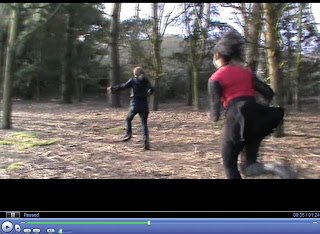
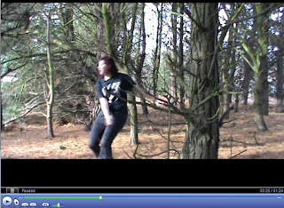
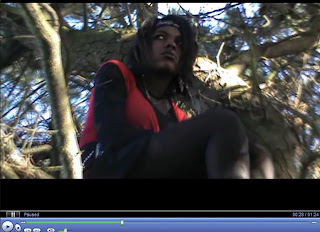
I think that I have used and challenged conventions of the horror genre using the the mis en scene, locations and camerawork such as the soundtrack, camera angles and edits. Both of these shots are similar in the way that both use a mid to long shot to capture 2 people running. The locations of the shots are both similar and so this works to my advantage, trying to portray a specific scene. In this scene I used a the mid to long shot was used of a women running away from another character, the killer, because I wanted to allow the audience to take in the surroundings, in which the most of my trailer would be filmed. As the trailer is filmed in the woods, I think that used the location convention to show the genre of horror. this is because a lot of horror films are filmed in the woods.


I focused upon my lighting throughout my trailer, having the cover of the trees as shade. although the trees created shadow, it was not enough to make the trailer look darker. Within this scene, I tried to use a limited amount of light to create a more sinister and dark look to the trailer reenforcing the genre, being horror. This is a typical convention within horror trailers that I tried to follow because it instantly represent to the audience that it is a horror trailer.


Usng a two shot helps the audience get to know some of the characters. this scene is very important in knowing what the rest of the trailer is, this being the equilibrium. having the two characters in the shot means that the audience can understand the link between the two characters and understand why, in the case of my trailer, one of the teenage girls went to the woods on her own. The shots are also used to show the emotional reactions between the characters and is used in most films, sometimes without even intending this type of shot to happen


I added text to my media product in order to give the audience more infomation about my media product. Above is an example of the text shown in 'The Hunger Games' trailer. Both trailers include infomation that does not give infomation about the events happening in the trailer but many trailes add infomation about other films produced by the production company. I have used this screenshot to highlight the use of developing of a real media products. the font is specific to the trailer as 'The Hunger Games' includes a golden compas which makes the text link to this. Although there is nothing to link the text to my trailer, i think that the font i used works well and highlights the name of the trailer more specifically.


Again this is another two shot which shows the emotional reactions between the characters in the fight scene. Most horror film trailers will have an aspect of a fight scene to make the trailer more intreresting, showing that the antagonist might not win the battle between good and evil.


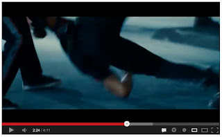
Having this low angle shot means that the audience can see upwards. This can make something seem more aggressive as they look larger and more intimidating. Having a low angle shot also means that the audience can view something that may not have been spotted by a character. In my trailer, this is the antagonist, in the professional trailer, it is the pece that is not visible from ground view.


I started the soundtrack that i used after the sound for the institution logo played. I listened to other institution logos to hear what sounds were used to combine with the institution logo and found that Metro Goldwyn Mayer used a loins roar as the sound to accompany the logo. i thought about adding a sound to my logo in the same way and decided to make the sound for the logo of an old fashioned film reel. The music to accompany my trailer was slow at the start and so i did not need to fade this at all. Most trailers make their music at the start of a trailer slow so that the sting in the music can kick in at the disequilibrium of the scene and connote an aspect of horror. Because the soundtrack gradually increased throughout the trailer this meant that i had used another convention that i had researched in other trailers.


Wednesday, 13 February 2013

Magazine Cover try 1

 
I like this cover but think that i could do some minor tweaks to it to improve it. For example add more cell line, and add the word film or movie above 'magazine of the year' so that the audience knows that the magazine is a film magazine. All the cell lines should be the same width in and so I would move the 'behind the scenes' and ' the ring' inwards to match the rest of the cell lines.


Tuesday, 5 February 2013

How I Created my Poster


This was the photograph I used to make my poster. I decided to edit the photograph In Photoshop so that I could control every aspect of how I wanted to make the poster. The first thing I did to this photograph was use the quick select tool to grab the model in the photograph. I then copied her onto a black canvas, the size of an A4 page. Looking at the photograph, I decided that I did not like how the arm on the right had some space around it and I didn't like this. I decided to crop the photograph to get rid of this. Because normally cropping the photograph would have meant that the page would have been smaller than the A4 page I wanted, I clicked on front image which means that the image is cropped but stays the same size as the original page size before. Because some of the hair had gaps in the grey background of the starting image came through. To resolve this I used the spot healing tool, which grabbed the colour of the hair and blended it to make it look like hair was covering each gap. Because some of the hair had bigger gaps than others, mainly on the left hand side of the image I decide to paint over the hair so it looked like my models hair was in a ponytail. I then used the paint brush to go around my model so that I could cover any grey edging that had been left when copping the image over.
 
After I did this I decide to change how the model looked, using the spot healing tool to get rid of any imperfections and the shine on her face. I also adjusted the brightness and contest so that the shadowing on the model would be stronger, thus making her look even more evil. I then flattened the photograph so that if I were to make any adjustments the background would be the model as well as the black background as well. Because I knew where I wanted to position my model and how I wanted the shadowing on her to look I was able to flatten the image. If I was not 100% sure then I would not have flattened the image because this means that I can still move my model about.

The image still was not eye-catching enough and so I decided to turn the photograph black and white and make a small amount of the photograph the focal point. I decide that the top my model was wearing and the necklace she had on would be a good focal point as they are both a bright red and so would grab the audience’s attention. These were both black and white though so I had to find a way of turning them back to colour. I remembered that the erase tool would erase any details added to the photograph other than the background so I went over the top with the erase tool so that the red top and necklace would become the bright red it was before changing it to black and white.

I looked through the fonts to find the same font as I had used for my trailer but I could not find it. I then decided to print scream the text 'SURVIVAL' and then pasted it onto the poster. Because the title of the film was copied from a black background, the face was covered by the title and black background, so I decided to use the erase tool to rub out the background and keep the text. I then moved the text to where I wanted it which was on the top of the head. I adjusted the brightness and contrast of the text a little so that the text was a little stronger in visibility.

I noticed that some posters had stars to represent reviews and i wanted to make my poster as believeable and relevent as possible. I used a star from google images and erased the white background so that the stars would look good on the black background. I then duplicated the stars so that there were five in a row and added a well known newspaper to the underneath of it so that it seemed that the newspaper reviewed the film. I looked at the poster so far and then decided that it looked uneven and so i decided to add another rewiew on the other side of the model.


Tuesday, 4 December 2012

Trailer Final


I like the way my trailer has been created. i like the edits and think that the camera shots and angles are good to. The only thing i would change would be the brightness of the trailer. This is because horror trailers should be dark to set the mood.

Friday, 30 November 2012

My Trailer First Draft

Teaser Trailer


This was my first attempt at creating my trailer. The length of the trailer is good for a teaser trailer but the trailer does not show enough information, in my opinion, to have a solid plot. What it shows is a girl trying to kill two other girls in the woods. We do not know why the murderer has chosen them, why the killer became a killer, why they are all in the woods, or whether anyone will survive. It does not show any suspense and does not leave the audience asking "what happens next?” Although all this information should not be revealed until the audience watch the film but some of the information should be revealed in order to create a secure plot. Having a cliff hanger at the end of the trailer, means that the audience will have got enough information in the first half of the trailer to understand a little about the film but will not know what is about to happen next and so may wish to go to see the film, on its release.

Thursday, 29 November 2012

Changing my plot


When planning my trailer, there were some things I could not cater for when creating it. Some of the problems I could have faced when creating my trailer happened, which lead me to change the story line of my trailers. The main reason for this was cast. I could not get the size of cast in which I wanted because the people I wanted to play characters were unavailable at the time of filming.

Monday, 19 November 2012

Problems Faced When Filming My Trailer.


There were many problems faced when trying to film my trailer. These included:

Actors not showing up.

Finding replacement actors.

Getting actors together in one place.

Finding a location that all actors can get to.

Camera shy.

Because this was not a professional job and the actors would not be getting paid, I would have to work around them in order to film my trailer. If this was a professional job on the other hand the actors would have to be at a set place, at a set time, specific to the director’s needs. As this is not a professional job, if actors do not show up for the date and time i set to film the trailer then this will not impact them, as it would me. If one actor does not show up than I would have to try to find a last minute replacement, and if this was not possible then I would have to reschedule the filming for another day. As I do not know many people and some people are camera shy, this makes things more difficult.

Some of the actors I am using have college 5 days a week and others work too. This means that the only time I would be able to get everyone together is on a Saturday or Sunday. Sunday is usually a busy day for all people involved as they are trying to get ready for college or work the next day. This then leaves Saturday, where we all are usually free to film. As the rest of the days are usually busy times, if something 'pops up' that an actor cannot control the likely hood that they would have to sort it out on a Saturday is very high.

All of the actors are between the age of 16 and 18 and so this means that although most are at an age where they can go to many places and be backing home at a late but reasonable time, some of the actors have a time to be home on a Saturday, which is usually early. This means that filming the trailer would have to be done quiet fast. With actors being reasonably young, finding a suitable place to film the trailer is important. This is important as some of the actors may not know where certain places are.

Not being able to have some actors together at the same time means that some sense may need to be changed so that the trailer can be filmed on two different days, with different actors present on each day.

Friday, 16 November 2012

My Institution Logo

As my institution logo has been created for a film trailer, I thought I could incorporate something relating to a film in the logo, which would 'connect all the dots.'
I decided as i am creating a horror film trailer, I should turn the background black, as this makes the logo look darker and slightly more horrifying.


After turning the background black I had to think of a name for my institution logo. As the image in the logo was a film reel I decided to use a homophone in my logo to add an afect on the audience. By switching the words 'Film Reel' to 'Reel Film' it sounds like 'Real Film'.

The text on the logo is smooth, looking like it has been writen using a fountain pen. This makes the the logo look safer. With the writing white, it contrasts with the black background. this makes the reel and the text stick out and makes it nore eye-catching.

Monday, 5 November 2012

Location Shots.

  My first choice of location would be in the woods. this is because the trees and plants can be used to hide characters, especially characters that need to hide from other characters, for example when the murderer hides when stalking a character to kill.
 
 
 This shot would be perfect to used when showing the graves. this is because it is still a woody area but also has the ground where the graves will be.


I could have one of the characters hiding behind a tree. this could either be a scared character, the investigator, or the murderer.


This photograph is dark and so gives it an ominous feel to it. This is what I would want to show in my trailer as it is a horror trailer. This means that to give the intended feel to the trailer I would have to film my trailer when it is dark. I would need enough light to make the actors show up on camera but i would not film my trailer on a bright, sunny day.


This is a prime example of the type of location shot I could use if for some reason I am not able to film at wolloten park.